The Challenge
Live sports streaming is contracted to have tight boundaries where it may be available for view on streaming platforms like Max. To accommodate contract terms, the data governing where sports live streaming on the Max streaming app contained geo coordinates for “allowed” regions and “blocked” regions. QA, Producers and Customer Support Reps needed a quick way to visualize the geo data and in the case of customer inquiries, see where the customer is relative to an allowed zone.
My Role
Define how to display a fast visualization of the raw form geo coordinates for allowed and blocked areas of a live event. Allow Customer Service to compare a user’s geoloaction to the live event areas to help determine if the event should be visible to them.
Visualizing Event and User Location
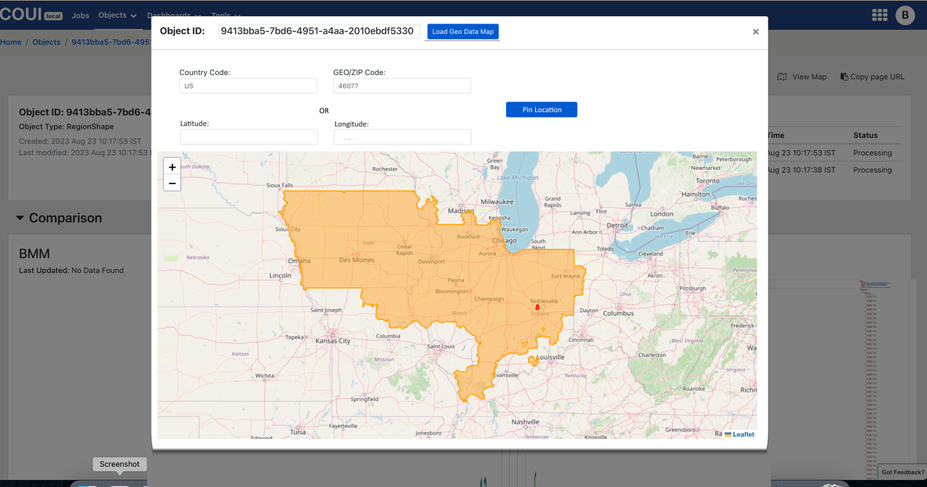
The Content Orchestration UI provided visibility into all the low level data elements that control and decorate content bound for streaming platforms. Its purpose as a troubleshooting tool was specifically geared toward visibility at the atom data level, so that exact information used to create subscriber experiences can be analyzed.
But troubleshooting geo coordinates of live events was faster if the atom data elements were represented in more than raw form. Checking the geo location data for a live event by overlaying the data region onto a map gave Customer Service a quick way to see if the data was covering the correct region. Adding a customer’s geolocation as another layer on the map helped customer service speed call resolution.